Radified is different from most other websites .. in that I didnt know where we were headed back when I launched it. Heck, it took a while just to figure out how to post a second page, and how to link to that page from the first. (No longer seem to have that problem.)
 This is because Radified began as a learning experience .. to learn-by-doing. (Which is the best way to learn.) So learning new, cool geeky things has been a main THEME here.
Choosing a domain name, signing up for a web hosting server, and finding a good FTP client .. that all seems so elementary now. But back then (in the summer of Y2K) it was exciting new territory that required lots of research.
So you could say Radified has taken a more organic path than that of most traditional web sites, which typically know where they want to go (conceptually) .. before the first bit of HTML is ever coded. This organic path-of-development applies also to » styling.
In reading about Web Design, one of the first concepts they hammer into your head is that of » identifying the THEME of your site. Once identified, you set out to develop a VISUAL METAPHOR to help support and promote that theme.
For example, a web site for a coffee shop (whose THEME is obviously » coffee) might use colors like mocha, the color of a cup of coffee, or cream, or even an image of some coffee beans .. as part of their VISUAL METAPHOR.
[ Where websites are concerned, THEME is closely related to » PURPOSE. Purpose determines content, and content determines THEME. ]
You can take the concept of VISUAL METAPHOR far as you like, going totally ape, or you can keep it subtle. I've always preferred subtle, understated styles. But that's just personal preference.
Even tho I've never studied the principles of VISUAL METAPHOR, or even heard of the term before reading this book, you can still see hints of it in my design on the home page (.. with its stated THEME of » Nuclear Grade Technolust).
For example, beginning each entry you'll find a yellow tri-blade radiation symbol .. making it easier to identify where each entry begins (notice how design is subordinate to » function) .. especially since it's the only thing yellow on the page, and yellow stands out so eye-catchingly on a black background.
[ Using a car-metaphor, I prefer the function-follows-style philosophy of Porsche to the style-leading flair of the Corvette. Again, this is merely personal preference. ]
 » Cherenkov Radiation & the Blue-Green Sidebars
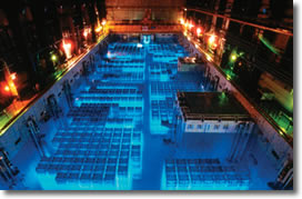
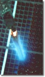
The color of the sidebars on the home page was inspired by Cherenkov radiation. You can actually SEE this radiation .. coming off the (super highly radioactive) spent fuel cells that are stored in water-filled pits (made of stainless steel, some 50-feet deep) at most commercial nuclear power plants ..
[ .. at least, until the government comes up with a plan to dispose of them. But nobody wants highly radioactive material buried in their back yard .. that will remain highly radioactive for thousands of years. Who knows what life and the climate will be like a thousand years from now? ]
This visible light (known as the Cherenkov effect) comes from charged particles (beta particles, better known as electrons) accelerating faster than the speed-of-light in water (.. where these fuel cells are stored). Light travels slower in water than it does in outer space, which is mostly a vacuum.
 I decided against upgrading