Radified is different from most other websites .. in that I didnt know where we were headed back when I launched it. Heck, it took a while just to figure out how to post a second page, and how to link to that page from the first. (No longer seem to have that problem.)
 This is because Radified began as a learning experience .. to learn-by-doing. (Which is the best way to learn.) So learning new, cool geeky things has been a main THEME here.
Choosing a domain name, signing up for a web hosting server, and finding a good FTP client .. that all seems so elementary now. But back then (in the summer of Y2K) it was exciting new territory that required lots of research.
So you could say Radified has taken a more organic path than that of most traditional web sites, which typically know where they want to go (conceptually) .. before the first bit of HTML is ever coded. This organic path-of-development applies also to » styling.
In reading about Web Design, one of the first concepts they hammer into your head is that of » identifying the THEME of your site. Once identified, you set out to develop a VISUAL METAPHOR to help support and promote that theme.
For example, a web site for a coffee shop (whose THEME is obviously » coffee) might use colors like mocha, the color of a cup of coffee, or cream, or even an image of some coffee beans .. as part of their VISUAL METAPHOR.
[ Where websites are concerned, THEME is closely related to » PURPOSE. Purpose determines content, and content determines THEME. ]
You can take the concept of VISUAL METAPHOR far as you like, going totally ape, or you can keep it subtle. I've always preferred subtle, understated styles. But that's just personal preference.
Even tho I've never studied the principles of VISUAL METAPHOR, or even heard of the term before reading this book, you can still see hints of it in my design on the home page (.. with its stated THEME of » Nuclear Grade Technolust).
For example, beginning each entry you'll find a yellow tri-blade radiation symbol .. making it easier to identify where each entry begins (notice how design is subordinate to » function) .. especially since it's the only thing yellow on the page, and yellow stands out so eye-catchingly on a black background.
[ Using a car-metaphor, I prefer the function-follows-style philosophy of Porsche to the style-leading flair of the Corvette. Again, this is merely personal preference. ]
 » Cherenkov Radiation & the Blue-Green Sidebars
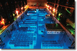
The color of the sidebars on the home page was inspired by Cherenkov radiation. You can actually SEE this radiation .. coming off the (super highly radioactive) spent fuel cells that are stored in water-filled pits (made of stainless steel, some 50-feet deep) at most commercial nuclear power plants ..
[ .. at least, until the government comes up with a plan to dispose of them. But nobody wants highly radioactive material buried in their back yard .. that will remain highly radioactive for thousands of years. Who knows what life and the climate will be like a thousand years from now? ]
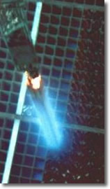
This visible light (known as the Cherenkov effect) comes from charged particles (beta particles, better known as electrons) accelerating faster than the speed-of-light in water (.. where these fuel cells are stored). Light travels slower in water than it does in outer space, which is mostly a vacuum.
••• today's entry continues here below •••
Looks pretty, no? Water acts as shielding. Twenty-four inches attenuates 90% of the radiation (ballpark). But 10% of a super-high level is still enough to kill you dead. That's why these pools are filled with 40 or 50 feet .. of the clearest water you've ever seen. (Think of the weight of all that water.)
These spent fuel cells as so highly radioactive that if any part of one were to break the surface of the water, it would kill everybody on the floor. (Talk about a bad hair day.)
Anyway, notice how the links 'glow' when you roll your cursor over them. Same goes for the blue-green navigation menu buttons located at the top of the center column. That's my visual interpretation of the Cherenkov effect.
See? There *is* a method to my design madness. =)
» Hyperlink Styling
Speaking of link-styling .. these 'Cherenkov-links' are the #1 favorite thing I like about the style of my home page. I like the way the link blends with the regular text, so as not to distract from reading. But they are conspicuous enough to avoid being missed if the reader has a question and wants more information.
This styling balancing act .. of blending the look of links with that of regular text, while maintaining 'enough' conspicuousness to know they are links .. this is what (I feel) comprises the essence of link design.
A link should speak loudly enough that you know one is there, but should never yell (.. or distract from normal reading). Subtle equals elegance.
Text should flow .. like a polished comb thru Cleopatra's hair. While impediments to this flow should be minimized (.. or eliminated, if possible).
I dimmed their color somewhat in order to better emphasize the 'glowing' roll-over effect. And I shifted the color a bit toward green to give the site some (styling) uniqueness. I havent seen another site with that particular shade of blue-green. Sometimes it actually feels retro.
[ Update 22.Feb - Nix that. Found one here » Focus Booster. Heck, they even have a black background. ]
The dotted 1-pixel bottom-border is pure accessibility. I'd rather not have it, stylistically speaking. It does its job of identifying links with less visual intrusion than the standard underscore.
The #1 stylistic thing I dont like about the home page? » I cant use drop-shadows on my graphics there (.. like I can here on the weblog) .. especially cuz I use quite a few images there.
 » Death by Radiation
Speaking of the Cherenkov effect .. there's a story about a nuclear engineer who was working at a plant in Japan. He had trouble seeing the serial number imprinted on the (metal) tag attached to one of the fuel cells being stored in a spent fuel pool there.
[ Note: when these brand-new fuel cells (loaded with uranium) first come into the plant, they're not very radioactive at all.
It isnt until they spend a few years 'burning' in a reactor core that they becomes highly irradiated (.. via intense neutron bombardment) & become loaded with fission fragments.
When all the burnable uranium has been depleted, the reactor is shut down and they are replaced with new ones. The old ones are called 'spent'. ]
Anyway, the story goes, this Japanese nuclear engineer, who was working on the night-shift (when everybody is usually tired and not thinking very clearly) got himself a long pipe.
He taped a piece of clear plastic over one end and stuck the pipe in the water, hoping this would allow him to better identify the serial number imprinted on the tag (.. which looks similar to military-style dog tags).
See the problem? By taping over the end, he displaced all the water (shielding) in the pipe. Now all that super-high radiation had a clear path out. And when he held the pipe up to his eyeball .. that was it. Instantly he fell back. Dead. I would imagine he saw a bright flash before his brain cooked.
[ Normally you only worry about when people wanna pull stuff OUT of the water. ]
Anyway, that's where I got the idea for the blue-green sidebars, and the glowing links & navigation menu buttons.
Cherenkov was a Russian (Soviet) who won the Nobel Prize in 1958. He's like a patron saint, cuz radiation is part of who I am.
 » Simplifying the Complex
Another THEME I try to incorporate into my VISUAL METAPHOR .. is » making complex things simple .. hence the site's simplistic design.
Simple color scheme. Easily readable fonts. A single horizontal line separates each entry. Where possible I avoid fancy words or unnecessary jargon.
Notice also how I start writing the content before the title-heading. The first paragraph actually precedes the title-heading. Not sure why I do that, but it feels right. Headings make the text easy to scan. And the images I include make it even easier. And clearer. No?
Realized early on that I had a knack for breaking down complex things into simple components .. so others could grasp them more quickly. Friends would often send me emails asking questions. I grew weary of writing the same answers over & over.
So I finally copy-n-pasted these emails into web pages and posted them on the site. I'd then send friends a link. These single-page instructions gradually grew into multi-page guides. People smarter than me began commenting and sending mail that contained technical insights .. which I used to update the guides. You get the gist.
Meanwhile, search engines (somehow) found these web pages. That's when visitors started coming and traffic began to grow. The rest, as they say, is history.
In college, I was always able to help classmates comprehend sophisticated concepts.
That's how I met Wendy, who approached me after class one day (Statistics, the day we got back our first exams) and said, "You seem to understand what's going on here. I do massage for a living and I'm pretty good at it. I'll trade you if you'll tutor me."
"Meet me at the Dietrich's coffee shop up the road," I said, intrigued by her offer. "We'll talk."
I taught her how to calculate permutations right there in the coffee shop (over a killer con panna) .. how to push the right buttons on her calculator. (You dont really need to understand permutations in order to calculate them.)
[ Yeah, she was good. Maybe too good. Knew I was in trouble when she poured that warm sesame oil all the way down my back and into the crack of my butt. Yowza! What were we talking about? =) ]
 » Fatherhood & Parenting
Later, when I became a dad, I started sharing some of my observations & experiences as a new father.
I now have quite a following (mostly European, for some reason) who come primarily for my insights into fatherhood.
Parenting is hard, even under the best of circumstances.
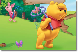
I often uses images of Winnie the Pooh when discussing things that pertain to parenting & fatherhood.
Parenting has been a priority for me these past several years. It has also taken a toll on me (physically, emotionally, financially), particularly the legal aspects.
But it has been worth it. Because the Bug is so cool. It would've been easier (for me) if I just let him go. But something inside wouldnt let me do that.
[ Speaking of fatherhood, I asked the Bug what his favorite foods were. He said, "Bacon. And candy." =) ]
 » Humanity & Heart
This is also where I try to inject a little heart into the site. Man does not live by technology alone. So I try to balance the teknical with some humanity.
I am much more human now than when I started this site. =)
Sometimes being human requires us to be brave. Because the storms of life come to us all.
Regarding the Bug, I received a few comments last week .. from people who told me things such as, "You can tell that boy is loved," and "There's clearly something special about him."
I watch their eyes closely when they tell me these things .. to see if they really mean it .. or if they're just being nice. (Yeah, they mean it.)
I expend mad nuclear-grade energy making sure that boy feels loved-to-death .. half of which is just showing up .. week after week (after week).
[ The part of the site that deals with parenting & fatherhood should probably be split off .. to a separate web site. Having my own Virtual Private Server (VPS), with WHM/cPanel would make it easy for me to host myself. ]
Speaking of madness .. uh, then there's Nietzsche. To what category, or THEME, shall we assign dear Friedrich? Well, insanity comes to mind. But Nietzsche is really about » morals, which are closely tied to values. (Never would've guessed that about him.)
There's a lot I could say on the topics of morals & especially values .. where I have unique experiences .. that have led to well-developed thoughts & opinions. But some things are better left at the coffee shop.
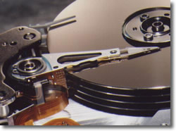 Hard Drive Backup Via Imaging & Cloning
Definitely the biggest thing (traffic-wise) Radified has been about is » backing up your hard drive with an imaging / cloning program such as Norton Ghost.
That's still what drives most of the traffic at the forum. Heck, it's where I go when I have questions. =) Smart guys there.
And along those lines, I should note that I upgraded the Rad Cloning guide last week.
Anyway this book on Web Design has me thinking about » identifying key THEMEs and musing ways I might develop a VISUAL METAPHOR to help support and enhance those themes.
Obviously have more than one theme. Humans are multi-dimensional creatures, which is probably why my website is too.
Programming has been my most recent topic-of-exploration in the tech world. Programming with PHP. Programming is both cool & powerful.
For more along these lines, here's a Google search preconfigured for the query » web design theme visual metaphor
