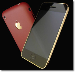
» Soon as I converted/upgraded the home page to HTML5, I started getting mail saying things like » "Rad, your new home page looks like krap on my iPhone." [ Doncha love the way my readers feel no need to sugarcoat. =) ]
 There've been other glitches I've been trying to resolve, and the iPhone issue wasnt a major problem, since visitors could always use the weblog (where you're reading now) which is based on Movable Type ..
.. which views fine in any phone. But I finally got around to troubleshooting the "looks-like-krap" issue.
Seems the entire center column would instantly plunge all-the-way-down to below the end of the blue-green sidebars .. when the page-width was narrowed sufficiently (.. to ~800 pixels, which is not very narrow).
It didnt do that before .. back when I was using the XHTML 1.0 Strict <!doctype>. CSS, which controls the styling, shouldnt be affected by the HTML5 <!doctype>. So, what gives?
You might recall how there used to be a Google AdSense text-links bar at the very top of the center column (black) .. right below the blue-green horizontal navigation bar (i.e. » Forum, Weblog, Guides, etc), which itself wraps just fine. The text-link bar looked like » this.
I could see the problem occurred soon as the width of the center column became narrower than the width of that ad bar (468-pixels).
I'm not sure why it now behaves like that, but I couldnt fix the problem with CSS mojo, so I just removed the sucker.
••• today's entry continues here below •••
Afterwards I added additional bottom-margin (2 em's worth) to the <nav> navigation element at the top of the center column .. to add a little more space up there .. cuz things got cramped when I deleted the ad-links bar.
If you're still having trouble viewing the page in your iPhone, lemme know. But I think you'll find the problem has been resolved.
It was perplexing .. cuz I use a 468-pixel width banner ad (not an ad-links bar) at the bottom of the first article .. and the text simply WRAPS around that ad .. as you narrow the page width.
Both were wrapped in a simple paragraph element, so I could center them. So why the text-links ad-bar didnt do the same as the banner ad beats me. Guess that's the price I pay for being an early-adopter. ■
For more along these lines, here's a Google search preconfigured for the query » html5 display problem iphone google adsense text links
